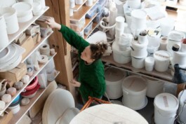
Working with the fantastic talent of Emma Louse Payne ceramic artist and almost engineer to build a brand that could live up to the immense work she is producing. I created a custom font that was the foundation of the brand, and from that we made a series of 'marks' or 'stamps' that she can use physically on her earthen ware. The marks took reference from early silversmithing. We particularly liked the way they could become abstract to the untrained eye, but hold a series of information by decoding or translating them.
www.emmalouisepayne.com
Studio photography: Louie Yeowart

( Another Territory exists within the Bracket ) It contains and shields